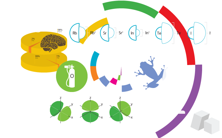
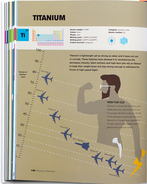
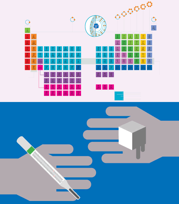
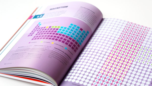
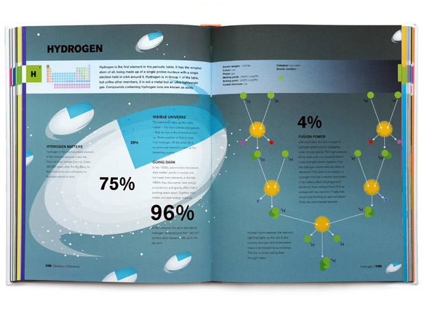
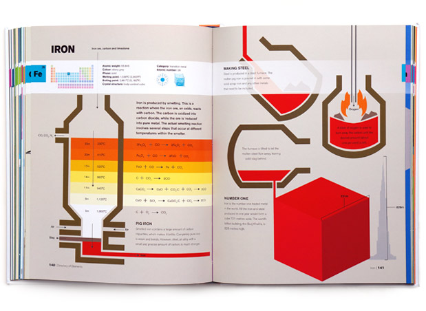
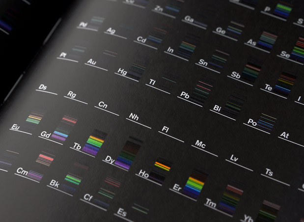
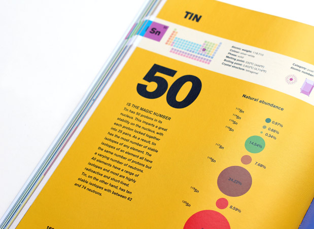
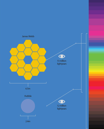
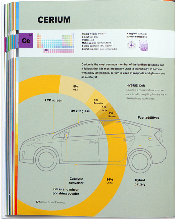
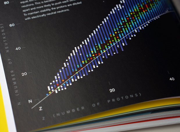
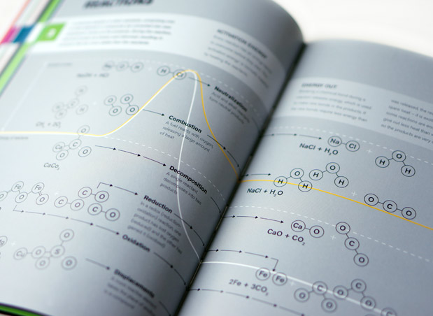
The Periodic Table: A Visual Guide To The Elements is a 224 page hardback infographic book containing hundreds of bespoke, scientific illustrations and diagrams. Commissioned by Arum Press, the content for the book was devised over six months by myself, design agency Urban Ant, and science author Tom Jackson. The aim was to create a pop-science volume that presented each of the Periodic Table Elements - one per page/spread - as an array of data translated into illustrated infographics.
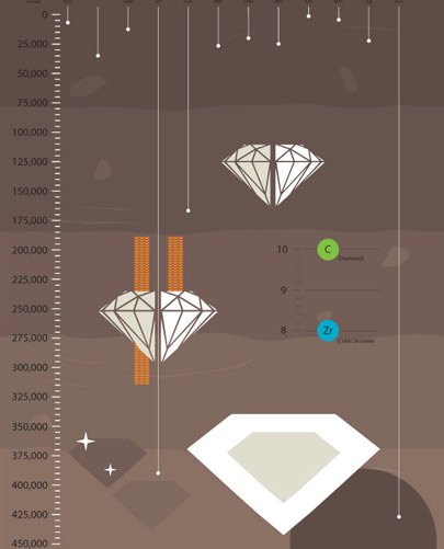
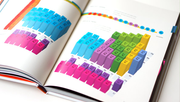
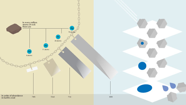
As well as drafting all of the initial layouts for the spreads, I was tasked with creating the individual illustrations and diagrams that made up the visual content. Where enough data points were available the page for an Element would form a graph(s) or chart(s) depicted in a unique yet logical way. For example, the Zirconium page has its content overlaying a graph styled to look like layered rock, with the data for cubic zirconia country abundance running downwards from the top axis, enforcing the idea of drilling and excavation. The page on Element Reactivity is shows the Periodic Table in a 3D relief format where the more reactive Elements climb taller than their neighbours.
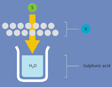
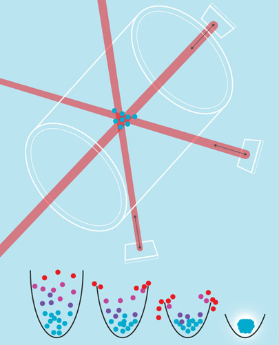
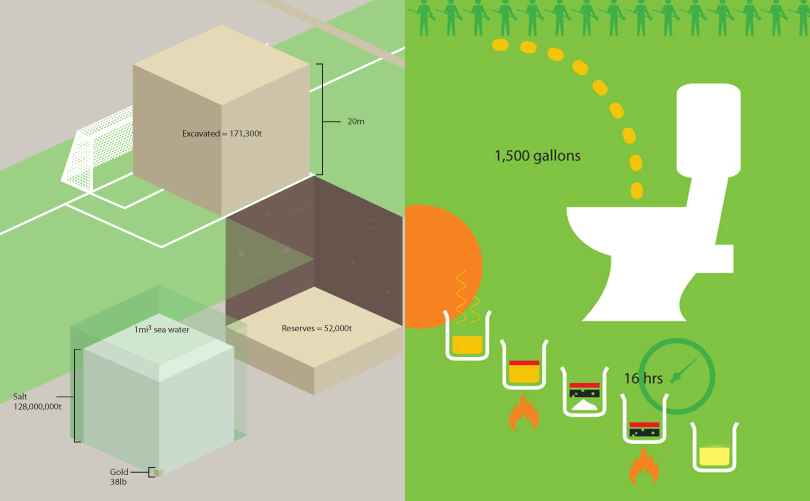
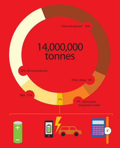
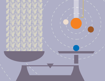
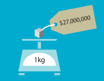
For the more obscure and lesser researched Elements that did not offer any robust dataset to visualise we established a 'flat', bold, adventurous illustrative style to depict physical items, materials and processes. Combined with the data-driven pages this made the entire concept of the book a mixture of science and creative interpretation forming hundreds of pages of infographics.
Interpreting what was often complex and very dry data was the most prevalent challenge in delivering this project, closely followed by the need to structure and balance the artwork around the page furniture and layout restrictions inherent in the book's design in a manner than did not obstruct understanding the data. A number of the pages abundant in data were heavily dependent on scale and spacing to be conveyed coherently, so designing the page layouts and the content therein simultaneously was critical.

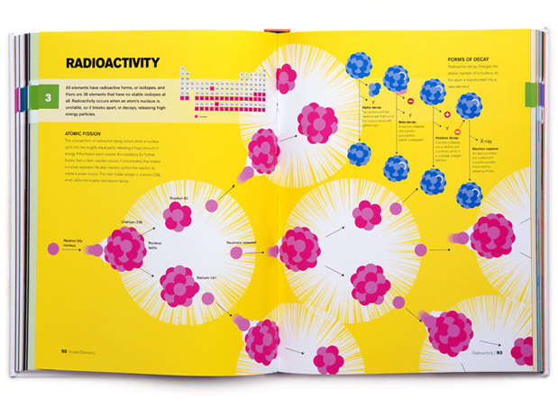
A few of my favourite pages in the book include Radio Activity, a double page spread discussing the various types of radioactive decay, set against a back drop illustration depicting the process of chained atomic fission. It's a vibrant piece composed almost as wallpaper, that plays with scale by simultaneously conveying the molecular event in the repeated illustration and the huge impact of nuclear explosion filling the double-page spread.
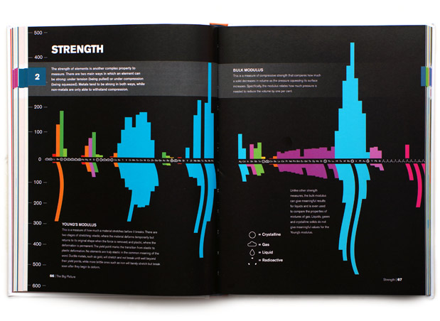
Pages 66-67, Strength - as well as being vibrant and visually striking, sucessfully convey both the Bulk modulus (compressive strength) and Young modulus (elastic strength) in a single graph, with the whimsical touch of slightly distorting the Young bars to aesthetically represent the stretching and elastic properties of all the Table's Elements.
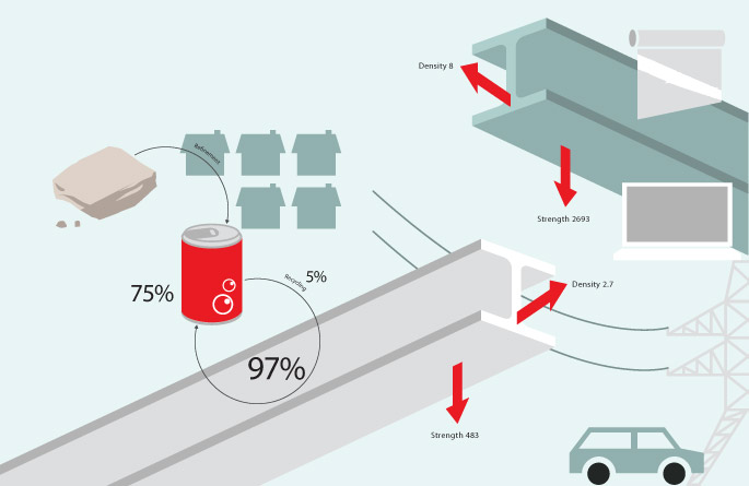
One of the more thoroughly illustrated spreads is Aluminium where the central oversized image compares the physical properties of a steel girder with an aluminium one, surrounded by several other satellite images that highlight statistics of its admirably recyclable property. The composition of beams traversing the gutter make for another attractive spread.
As a major exercise in visual communication, colour coordination and creative expression this project took approximately six months to complete and in terms of volume, is one of the most complex illustrative commissions of my career. The result is 224 pages of exceptional interplay between traditional data representation and modern minimalist illustration that makes this publication fit for classrooms and coffee tables alike.
