Website design and build
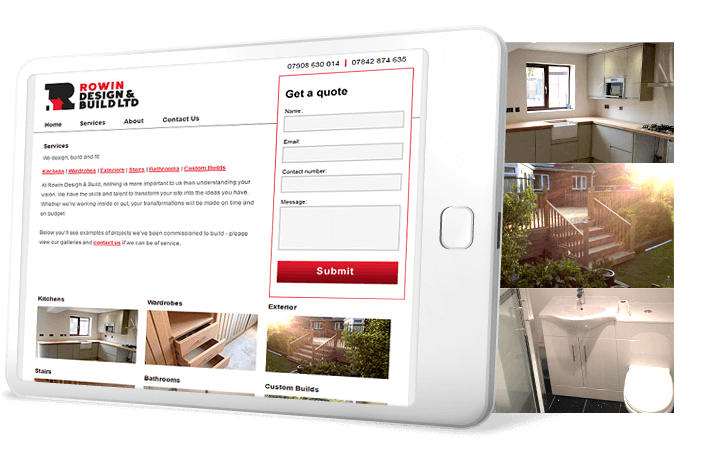
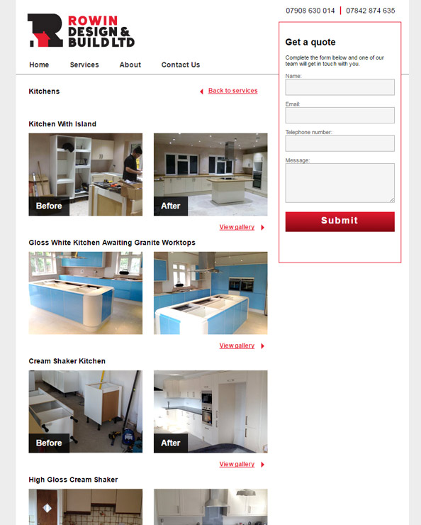
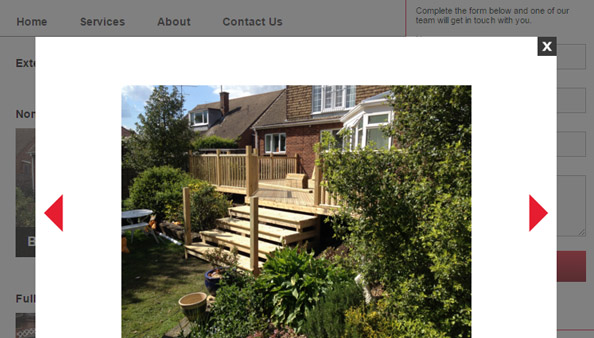
Startup company Rowin Design & Build came to me armed with a smartphone filled with photography of their bathroom and kitchen installation projects, looking to have their first website built. After a brief meeting with the client they opted for my cheapest website package with a gallery bolt-on, meaning that the site was delivered and live in just a matter of weeks. The core requirements from the client were to properly showcase the building and renovation projects as photographic albums, and to ensure that users could contact the company with ease. My In+Out website package offers a template design that's perfect for the latter requirement; an omnipresent contact form with validation, plus prominent display of contact telephone numbers. The gallery bolt-on that I coded separated each photoset by category and project, allowing the client to display their work with more context; rather than a portfolio of only the best shots, each album shows the complete progression of a project from the bare and broken walls through to the sleek and stylish finishes.

Logo design and brand design
Before I could begin work on the client's new website I had to first complete the development of their brand image. From the very beginning the client was partial to a red and black colour scheme and was keen to incorporate some visual element of their building trade into the logo design. Using these requests as a starting point, I drafted up several logo design concepts (below), each using roofing shapes to not only denote building trade rhetoric, but also to emphasise that the client dealt predominantly with domestic projects rather than commercial ones.
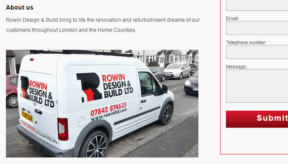
After considering each of my approaches the client favoured one of my more clever ideas which playfully tracked the contours of a typical house structure into the letter form of a capital 'R' in a slab font. The serifs of the letterform were key to creating the illusion while keeping the design legible and understood. In fact, the client felt that the design works so well that the 'R' emblem is used as a standalone representation of their brand on their workwear and vehicle signage.
