Website design
Hathway Hawkes are a print agency with design leaning based in south London. When they came to me earlier this year they were struggling to establish a coherent web presence that resonated with their target audience, so commissioned me to not only build their website, but also define their voice.
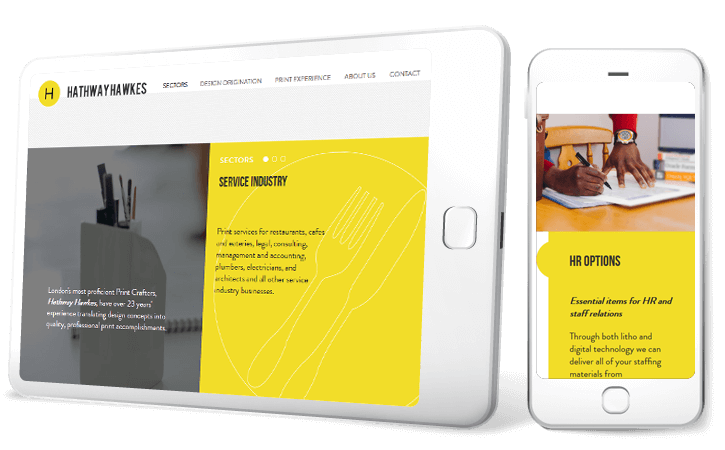
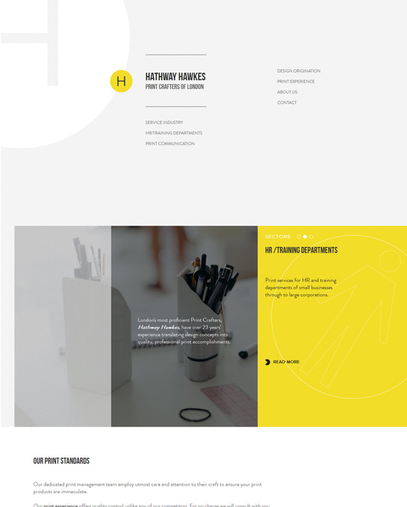
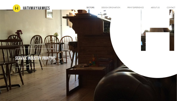
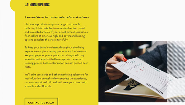
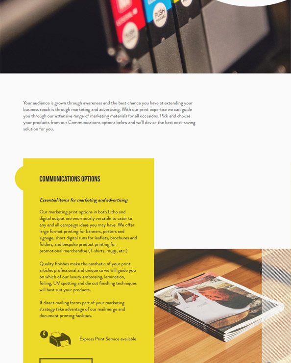
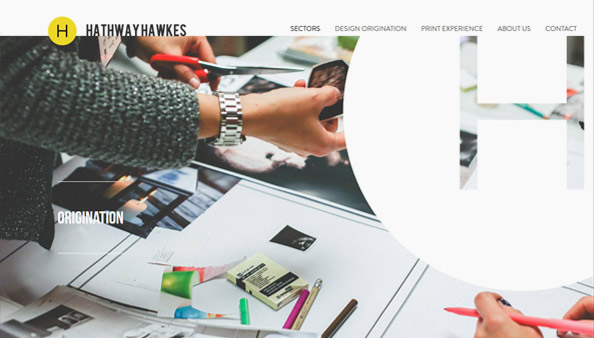
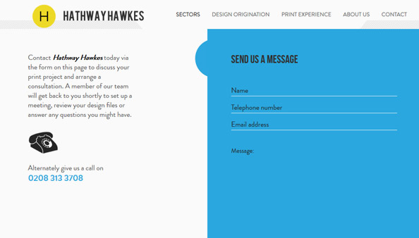
From the very commencement of the project I was adamant that the language of the site would align to a higher calibre of client, so I wrote all of the site copy with boosted intellectual appeal. I was also keen to develop a site that differed greatly from more conventional layouts that would allow the brand to define itself in a larger, more impactful way. The result was a bespoke grid framework parrying oversized photography with floating content panels coloured to match the brands CMYK palette.
Of particular note in this website design is the recurring use of svg artwork, utilised for its low-impact load time and ease of manipulation through animation. A number of pages bare oversized icon-like vectors that drift through the responsive layout, punctuating the photography and complementing the stark and piercing persistence of the font and logo styling. Presenting content that's predominantly text-based in an interesting way is a common challenge I face when designing websites. In this instance the vastness of whitespace, the language found through clean edges and the choices of stylised photography all work together to balance the text in a harmonious way within each page layout.
