Whilst working on a development commission with
The Heart Of England Forest I was introduced to and liased with the team at
fb2 Consulting. Shortly afterwards we established our own working relationship as the consultancy firm hired me to revamp their own company website and logo. After our initial meeting I ascertained precisely what it was the company was looking for - an essential redevelopment of the Client's identity to replace the underwhelming visuals currently in place. To kick off redesign process I first turned my attention to reviving the logo.

Logo design
The Client spoke despondently of their current logo and regarded it as more of an obligatory placeholder persisting from their start-up years. The emblem had reason to its construction (a sequence of asymmetric atom-like shapes interlocking into each other's negative space) but was fairly generic for the industry, plus the text portion beneath was entirely uninspired and was wedged awkwardly in their website's masthead. My task was to devise a logo that ameliorated these afflictions whilst enhancing the company's professional appeal.
The 'interlocking' aspect of the previous logo needed to be preserved as the Client wished to convey a sense of integration, completeness and efficiency. These themes inspired me to generate a handful of concepts, which I'd taken from sketch through to digital draft and presented to the Client. Their favourite was a trio of rhombi combined to form a new six-sided entity with sharply contrasted shadows at each intersection. The palette and type were influenced by the existing logo of the Client's flagship product Donorfy thus making the two synonymous.
The completed design is compositionally flexible allowing use of both the full and abbreviated versions to suit context, plus the emblem can be easily isolated for more space-deficient applications such as social media identity, browser tab icons etc.
Website design and build
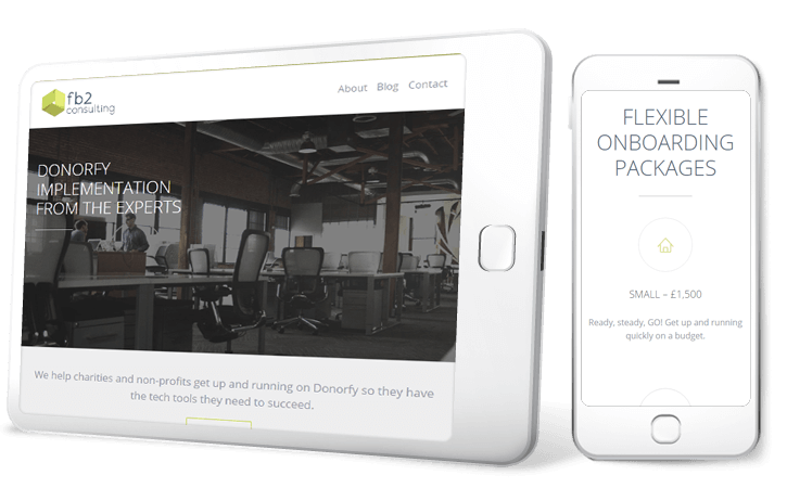
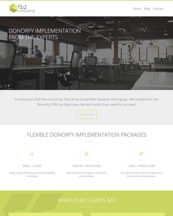
With the new identity established I moved on to the website redesign phase of the project. The Client was keen to retain Wordpress as the site's CMS platform but required a fresh theme and templates to house their content. We elected a third party theme that catered to their needs and I began work on tailoring its styling to better carry the identity. Pale tones and a contemporary font gave the design a neoteric quality and the photographic element I treated conveyed the sense of dynamism in the office the Client desired. I also used the rebrand as an opportunity to entrench more of the logo's colouration into the design.
Because the site exists within the Wordpress engine the Client has been freely creating and modifying content from the moment I completed the design work.


