iOS App Design
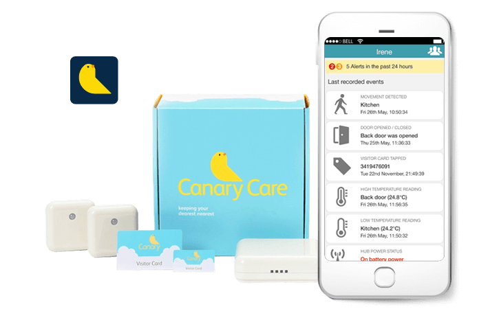
App development house Mobikats invited me to collaborate on a project with their client Canary Care to help expand the scope of their digital product into the app space. Canary Care's non-intrusive sensor hardware and online portal enables users to set up real-time reporting systems around the domiciles of elderly and vulnerable people, ensuring their safety can be monitored from afar. Sensors around the home relay feedback on room temperatures, door opening and closing events, visitor activity and more, to a central online dashboard that outputs as timelines, graphs and alerts.
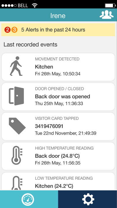
Though the web portal was a great first move for the client they understood that the real power in relaying real-time information to users exists in the always-on ecosystem of mobile apps. The objective therefore was to build an iOS app that would take all of the activity from a sensory network and in addition to reporting it in the current web portal, would also channel it into live notifications and monitoring, calling the user's attention to potential urgent situations as they arise rather than after the fact.
Mobikats commissioned me to handle the design of the app, from outlining the user flow, to wireframing the UI design, to mocking up the completed renders. The challenges I faced while answering this brief were abundant, which made this a particularly appealing project for me to work on. Refining a user flow to both conform to the prescribed standards set by Apple and be intuitive enough to navigate in a potential crisis was a critical part of the initial concept development, resulting in a simple icon-driven dashboard display from which all subsequent data could be accessed.
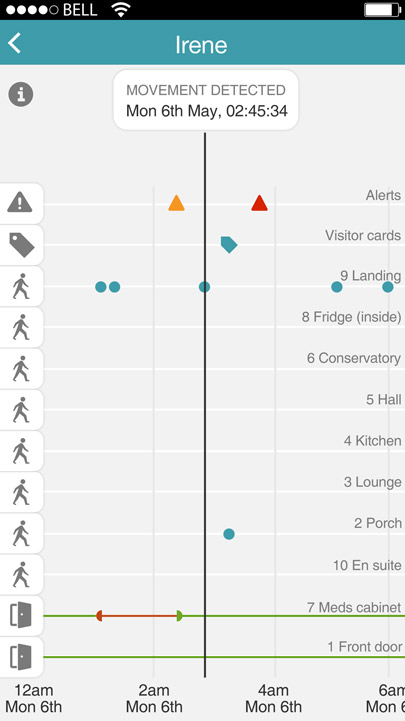
Thereafter came the universal obstacle of limited screen real-estate afforded by Apple's iPhone products. In particular, utmost consideration needed to be paid toward how the 24-hour timeline data of up to 12 variants could be comfortably displayed and inspected in a portrait orientation. The solution I designed again utilised iconography for ease of reference, but also floated labels, plot points along horizontal gridlines, and a central vertical crosshair that would generate a tool-tip style breakdown when coinciding with a plot point. The pinch/zoom mechanic was also implemented to drill down into the x-axis timeline.
Now signed off, the Client is very pleased with the current iteration of the app and feels that it is a more than ideal translation of the web interface.


