Start Up company 12th Man Group help align businesses and their marketing with credible channels in the sports industry. Through a combination of athlete and sports-personality affiliation, coordinated events, and unique marketing opportunities, 12th Man Group make identifying with sports and fitness more accessible to non-sports-orientated enterprises.
I began working with the Client at a very infantile stage of their creative development; one of the initial meetings we had together was to devise the name for the company for example, and it was owing to such early involvement that I came to fully understand the sporting ethos that would drive this very ambitious project. And so we moved on to the creation of the full visual identity...

Logo design and brand design
At the heart of the Client's ideology were two key criteria; championing the heritage of sport and bridging the gap between commercial/corporate entities and die-hard sports fans. The latter is what inspired the company name 12th Man - a widely used term elevating the status of fans on par with their favourite 11-a-side sports teams. It signifies inclusion, unity, and is an effective metaphor for their communication model.
The logo for 12th Man Group design is where I began developing the brand. I explored a number of potential directions both on paper and through digital renders, taking inspiration from all manner of sporting graphic rhetoric including classic team badges, sport apparel brands and retailers, and sports news outlets.
After a few rounds of feedback from the Client we arrived at this final design; a balanced, dynamic composition of slender type and disciplined line-work influenced by pitch markings, rendered in a traditional sporting grass green.
With the logo design signed off I turned my attention to developing the rest of the visual identity, comprised of strong palette, patternation and high impact photography.
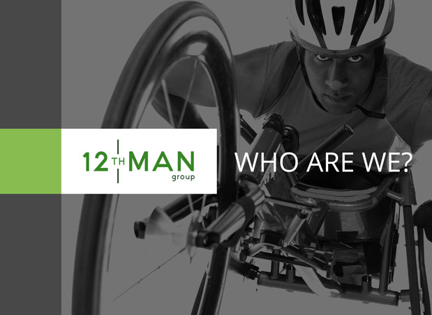
Photography of sporting activities carried out predominantly by women and disabled people became a core component of the brand owing to another pillar of the Client's ethos; that sport is accessible to all who adopt the correct attitude, determination and a willingness to achieve their goals (literally in this treatment).
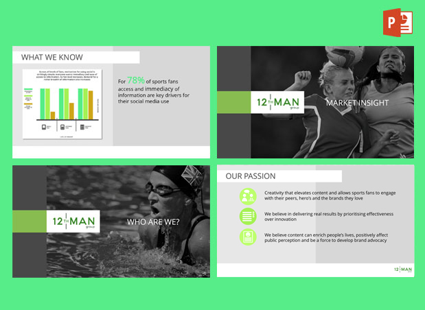
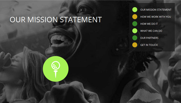
Having procured a selection of imagery befitting this ethos, cover art for PowerPoint slide decks, the website homepage and social media wallpapers were soon devised. Low-level treatment and offset composition allowed me to develop the language of the identity further, exploring styles for foreground furniture such as reversed-out headlines and block-like forms, organically arriving at a secondary palette of greys and limes.
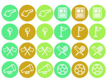
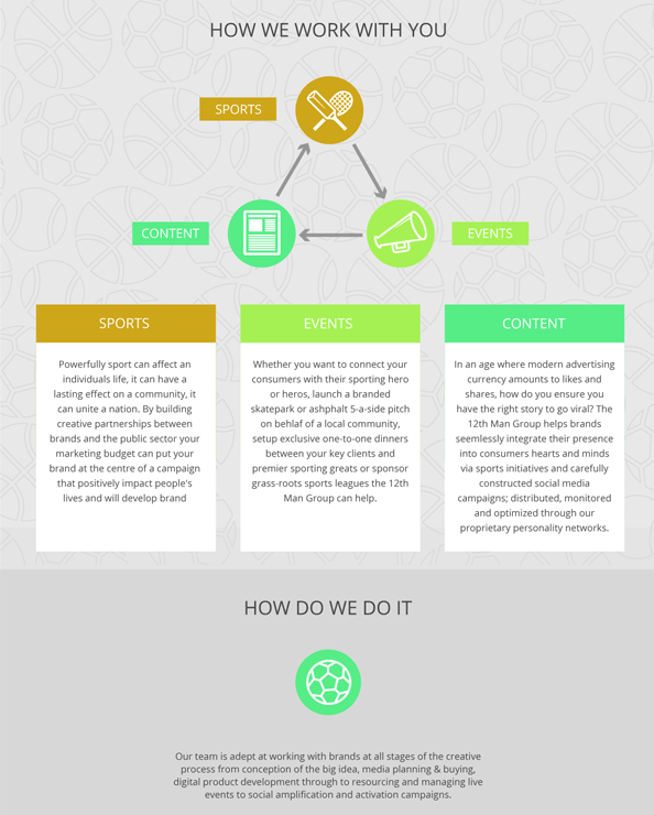
To complete the identity kit, I moved on to generate an icon set and background tiles; electric-toned vector graphics that sought to give the content more structure and punch. For these, I again looked to the logo design's primary influence and created the set to evoke the simple consistent linework of pitch markings. Backdrops for branded collateral were designed to be tiled patterns of mapped-out, decipherable curves found in the segmentation textures from various sports balls. The icon set - also unquestionably round - was designed to be soft-bevelled linework portraying simplified items of sporting rhetoric, applied with double meanings where possible. For instance, a golfing tee-off icon features on page one of marketing slide decks and before the opening texts of the website, a cox's calling megaphone is used to denote events and announcements, a football is placed at the head of the Client's "Aims and Goals" doctrine and the "Contact Us" page is offset by a referee's whistle.
Website design and build
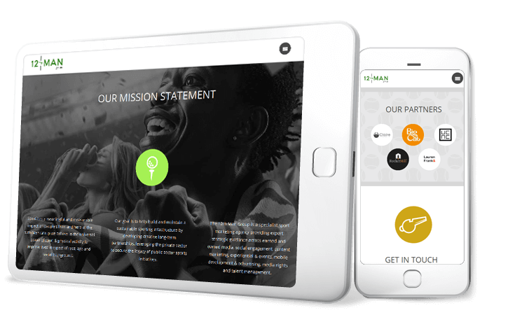
As the brand identity portion of the project drew to a close the Client grew keen to launch their website to enforce the credibility of their position. But as is often the case with most Start Ups, this early stage in the company's growth had yet to yield content truly reflecting the Client's testament, so a comprehensive website was not the correct course at this time. Instead the Client opted for a single-page scrolling site with sticky header, rolling users to and from cleanly laid out chapters of the company's aims, partnerships and ethos.
Making full use of the newly established brand assets I designed this website to look slick and run smoothly and responsively across devices of all sizes. By writing the layout code from scratch I was able to appropriately accommodate the copy and content supplied by the client without settling for stuffing it into a predefined third-party template as is the practise of less fastidious development houses. Moreover, coding the site from the ground up meant I could introduce subtle animation for a polished experience, including soft entry and click-out-conscious navigation menu, subtle button rollovers and click-generated caption loading.
Business card design
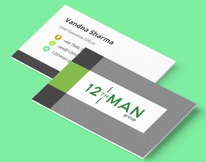
Business card design is always high on the agenda of Start Up branding projects and 12th Man Group's was no exception. By reconstituting elements of the brand identity devised for other items in their collateral, I designed very complimentary cards for each member of the team. On the face, the card took its cues from the slide deck cover art, only with the low-level photographic backdrop substituted for one of the darker pattern tiles. The logo portion of the face was traced with a spot varnish at print.
On the reverse, the layout reflects that of the website "Get In Touch" chapter where the correspondent information has been accentuated by further iconography. This overall design was replicated digitally when I created additional HTML email signatures for each of the team.
